
ICEBERG UI Design Project
ICEBERG
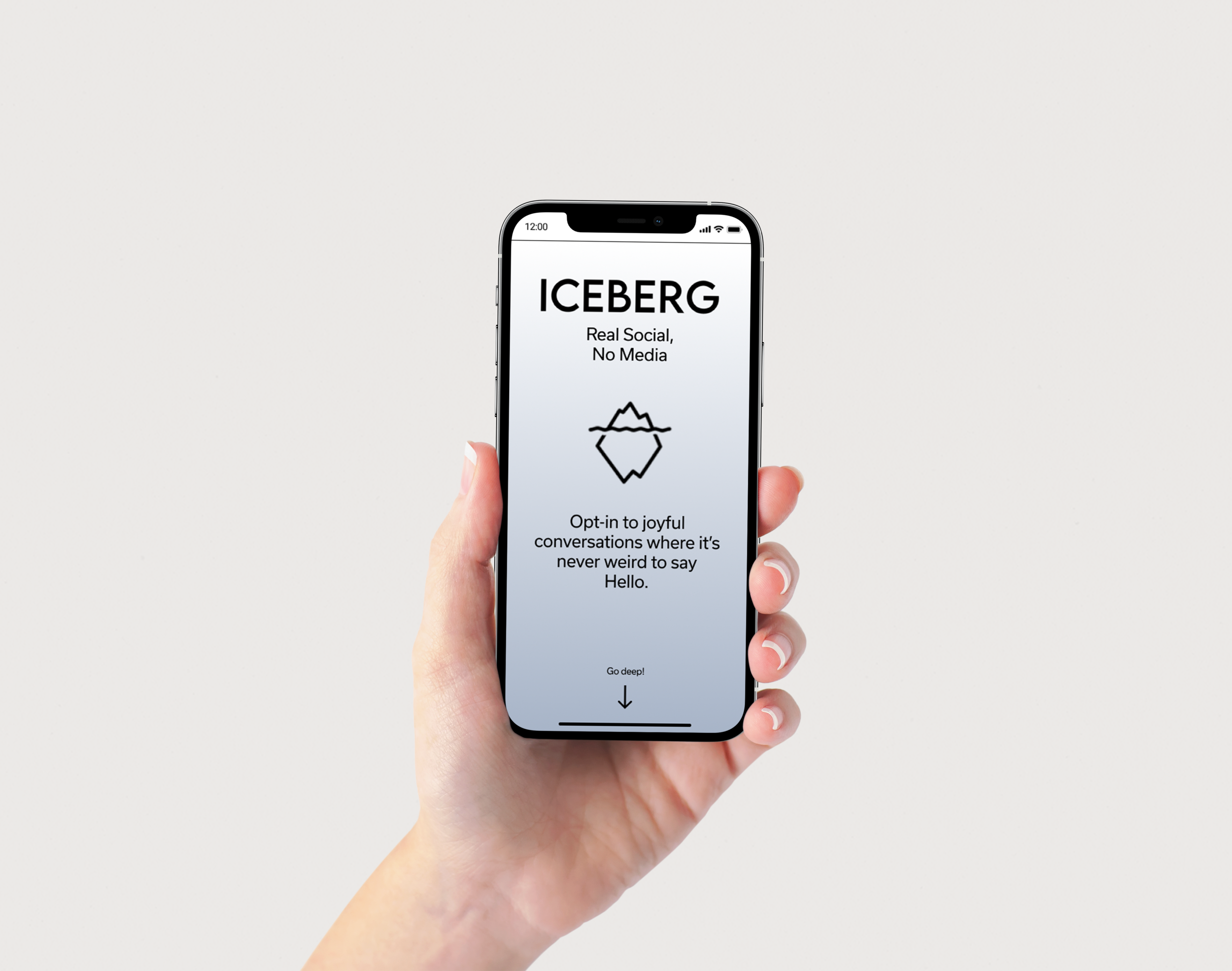
ICEBERG is a social messaging app with a mission to connect people with old friends and or family. Founded by Ikram Hoque, ICEBERG seeks to break general social app stereotypes and create a new platform with new features to help connect people with those in their contacts list. This project was started to create a new interface that would define the identity of the application and would offer a “buttery smooth” experience to users that would be introduced in the launch of the product.
My Role
Design lead responsible for designing and organizing progress reports on wireframes, prototypes, mock up and the final product.
Tools
Figma
Miro
Google Suite
Hypothesis
Users need an efficient way to spark and maintain conversations with those who matter most, past and present, so they can experience the joy of human connection deep within their networks, on their time and without hesitation.
Product Goals
Create a new interface where users, new or returning, can navigate seamlessly through all of the features.
Design a medium for users to seamlessly connect with those of whom they have lost contact with over the years.
Design
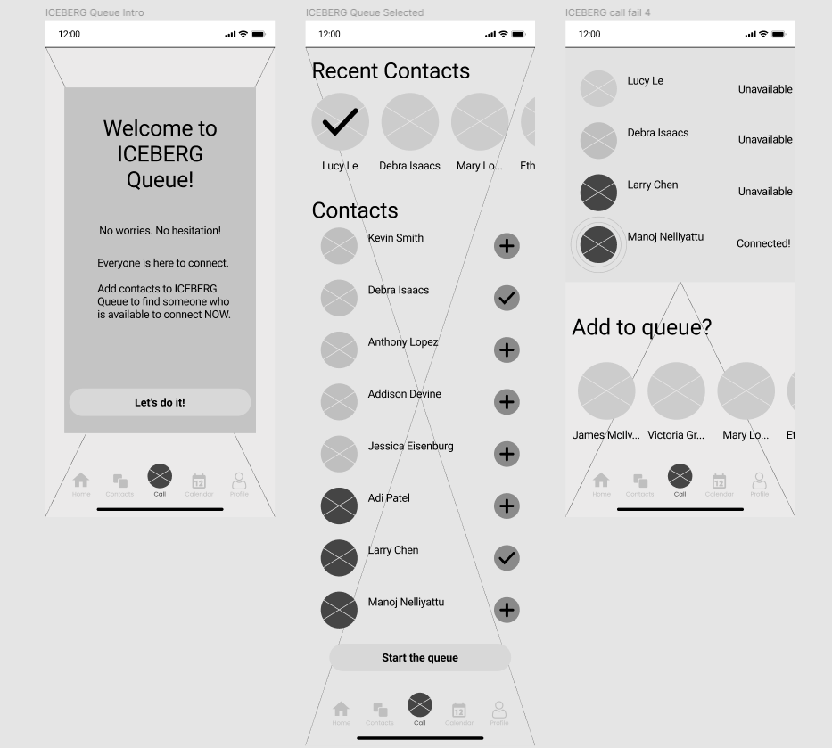
Following a research phase, I set about designing an interface that would be easy for users to navigate with no obstacles.
Key Features
A spontaneous call function that allows users to add contacts to a queue to call to see who is available to talk to, known as ICEBERG Queue.
Organization of reminders, messages, calendars and contacts.
Question of the week to spark conversations with those in users’ contacts list.
Contacts Page
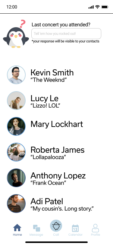
Question of the Week Page with answers
The Solution
The team conducted a total of 5 usability tests to understand how users interact with the new application. Using that feedback, the design was improved to be more intuitive and easier to navigate and understand.
Key Insights
The purpose of the app was not clear to users, and some were confused as to where it would fit in the current world of social applications.
The function of the ICEBERG Queue was not clear enough to users.
The interface was thought to be clean and intuitive and users had no trouble navigating through the app.