
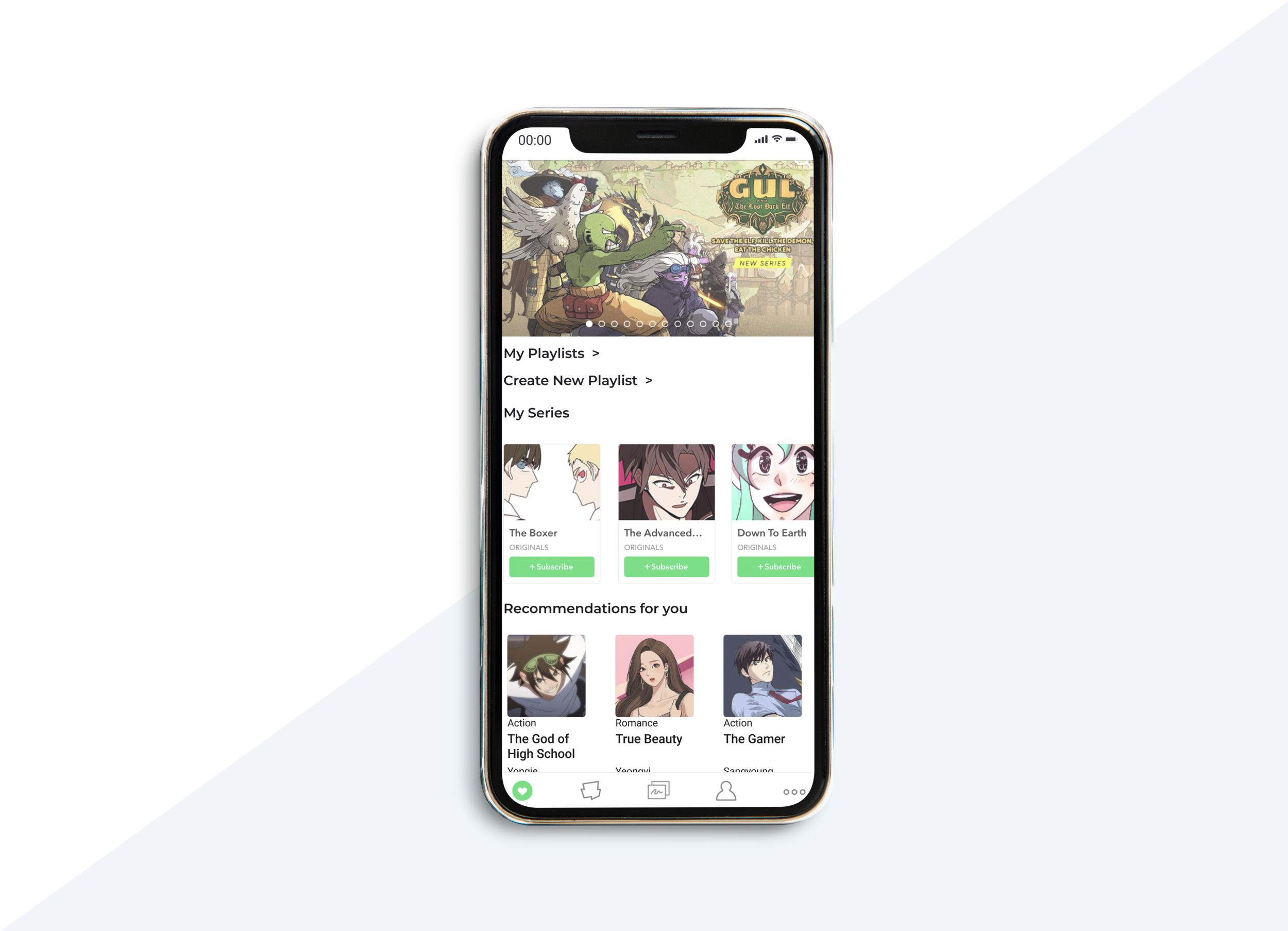
WEBTOONS App Revamp Concept

Webtoons is a comic creation, sharing and reading platform started by South Korean company, Naver. It has managed to cultivate a massive and active community that loves the platform and interface. This project was developed to discover pain points users experience with the app and design a solution to resolve said pain points
My Role
Design lead responsible for wireframing, prototyping, usability testing and designing the final product
Tools
Figma
Google Suite
Hypothesis
Webtoons users need a better and easier means of engaging with the community because they find it difficult to get in touch with artists and read about a series without going through each episode.
Product Goals
Deliver new features to Webtoons without compromising the look and feel of the original app
Expand upon the way users interact with the community
Discovery
As a team, we conducted 3 user interviews to gain data and try to understand the pain points users face with the interface in its current state. Using this data, the team was able to put together a proto persona, or a model user who summarizes all of the users we interviewed, that would help us empathize with the users.
Key Insights
Users wanted to engage more directly with other readers and creators
They also wanted to find better ways to integrate Webtoons into their busy schedules
Users were not hindered by the original layout and even preferred it to any other solutions
Design
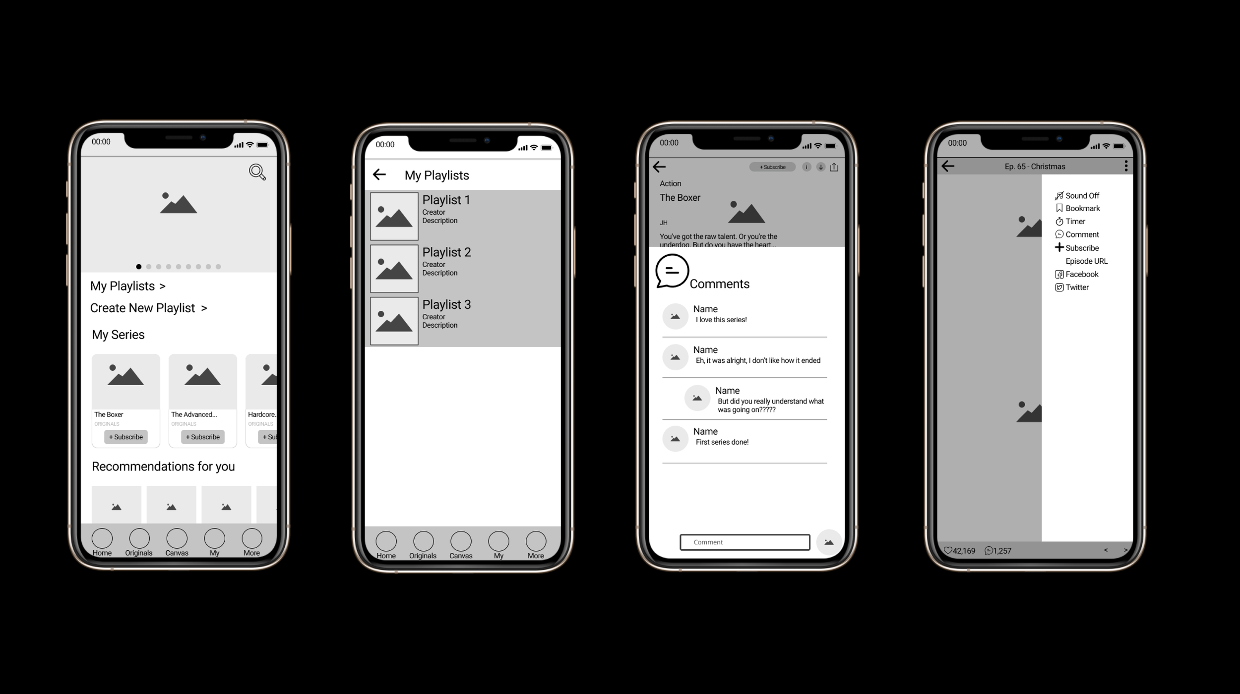
Based on the data we received during the research phase, I wanted to introduce some new features that would allot the company to engage with the community more as well as to help the community engage more with others.
Comments section for users to read and talk about the series as a whole as opposed to each individual chapter
Bigger emphasis on advertising events taking place on the app
Reworked menu in the reading screen to bring more features to the reader for easy use
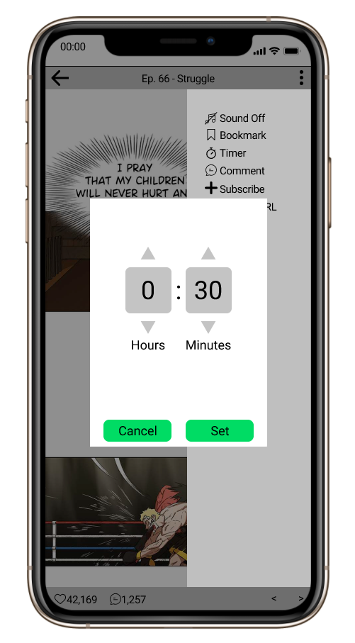
Timer Function
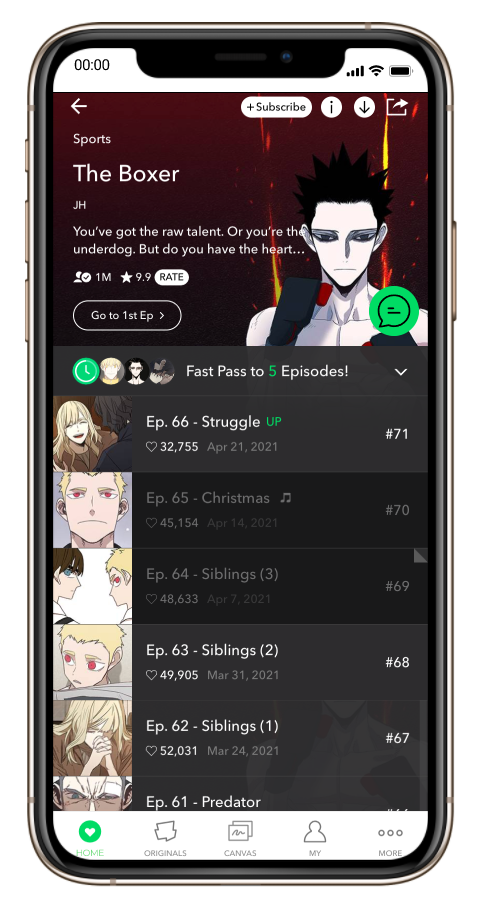
Series Comments Section (Green Button)
The Solution
After conducting a total of 3 usability tests, I created a mock up based off of the original design
Key Features
Playlists function to help users organize and share their favorite series
Timer function to help users budget their time reading
Bookmark feature that does not disappear after opening an episode of a series